Thursday, May 24, 2012

Show us the better way at Spadina station

Here is the unabridged version of my Grid idea to improve Toronto, which I titled “Toronto sUXs.”

The morning commute via the southbound Spadina streetcar is a terrible user experience (UX for short). It doesn’t have to be.

Inside the Spadina subway station, three long snaking lines of people waiting for southbound streetcars block the flow of transit commuters exiting northbound cars. A few hundred dollars in vinyl floor signage could indicate the optimal line-up configuration so people don’t have to guess. Built into this signage would be strategic gaps where perpendicular commuter traffic could pass through the line. Currently people have to poke their way through the fence of people between them and the subway stairs. That sUXs.

This is not rocket science – just a bit of design thinking. Step One: Observe how people actually use Spadina station. Step Two: Offer a solution that respects natural human instincts. Design thinking doesn’t have to involve visionary, Bruce Mau fantasies of iStreetcars powered by unicorn laughter. UX does the most good when it invisibly solves the major problems that people face on a daily basis. 

Wednesday, May 23, 2012

The agony of empathy

My wife and I were in New York recently, and as part of our week-long whirlwind of art, artisanal donuts and culture, we went to see School of Seven Bells play live.

As is now the case, not quite half the audience spent a considerable amount of time taking photos or shooting video of the concert with their smartphones. I'm old enough to remember a pre-cellphone era when cameras were banned from concert venues, along with any kind of audio recording devices. The only people allowed to snap were professional photographers. Normal chumps like myself had to rely on their memories of the event. This is why we oldsters hang onto ticket stubs -- although those are slowly disappearing as well.

A year ago, I would have been truly annoyed at the Japanese woman (call her Mary) beside me who spent almost the entire concert taking photographs. Mary had a very expensive camera (not smartphone) with a heavy-duty lens, but due to her height (she was quite short) she had to keep putting the camera above her head and snap blindly. This was somewhat distracting and also somewhat confounding to me.

But it was no longer annoying, because I now try to tap into my empathy reserves. Thanks in part to my five-month stint at the CFC's Media Lab last year, coupled with my new employer's focus on design thinking, I'm trying to do a better job observing how people act in a given situation. I then try to figure out why they are acting the way they are. From this, I try to think of ways to augment or shape that natural behaviour in new and interesting ways.

From my point of view, it's agonizing to realize that Mary's defining experience of attending the concert was getting the perfect photograph. She might not have been as "in the moment" as I was, but what she wanted from the concert was something very different than I did, and I need to be comfortable with that fact. Her perfect photograph will serve as the anchor point for a particular memory.

It is tempting to try and argue that there is only one proper way to experience a concert. I certainly had this thought when I saw The XX two years ago at the Phoenix. Along with the smartphone photo bugs, there were a surprising number of people texting their friends or sharing their reactions on social media. Personally I would find this disruptive as all hell, but to the texters and the tweeters, the concert would have less value and meaning if it wasn't shared with others. My experience and their experience of that same concert was certainly very different, but it's tricky to get into a debate about which approach is quote-unquote better.

Getting back to empathy, one goal might be to find a way to further enhance the experience of those who like to take photos during concerts, without this detracting from those who decide to not obsessively document the show. After the concert, my wife and I brainstormed some ideas. For example, in the near future you might be able to instantly send your concert photos to a public cloud service that projects those images on a screen behind the band, moments after the photo is taken. Or the band could assemble a stop-motion video for each song they play live using the various photos taken at a show -- they could even take advantage of time-stamping and other metadata embedded in each photo to accomplish this. And since the various photos would all be taken with different cameras, different filters and from different angles and parts of the room, you'd get a unique, kaleidoscopic, crowd-sourced visual document of the concert.

Those who chose not to take photos could visit the band's website the next day and compare their experience with the photographic jigsaw. This would be great, since there was one very talented guy taking some amazing photos with his smartphone. I'd love to see those.

Empathy is not an easy thing to deploy, but it can take you in interesting new directions. What's important to me, however, is that you can still insert critical judgement into this process. It might be delayed or deferred, but not every new development is necessarily better.

And yes, I took a few photos. Three actually. For whatever reason I'm still not comfortable snapping constantly during a concert. Here's the best of the bunch.



Wednesday, May 16, 2012

Instagram is eating its own tail


A few weeks ago I wrote my first post for Nurun’s Digital for Real Life blog. I piggybacked on a great article published last year by Nathan Jurgenson and used it to argue that Instagram's popularity might actually cause its demise (as opposed to the recent Facebook acquisition).
What no one seems to be talking about is that Instagram’s continued popularity, not its merger with Facebook, might be the biggest threat to its long-term success. In a long and thoughtful essay published last year at TheSocietyPages.org, Nathan Jurgenson, a PhD. student at the University of Maryland took a careful look at what he calls “faux vintage” photography. […] For Instagram, the challenge is figuring out what happens when their users, through their own enjoyment of the service, drain the last traces of authenticity from it. Printstagr.am, a new service that “develops” your Instagram photos into t-shirts, stickers, posters and minibooks might help turn the tide, as it turns purely digital artifacts into permanent physical keepsakes.
You can read the entire post here.


Friday, May 11, 2012

13 ways of looking at selling out

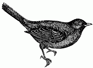
Okay, the title is a bit of lie. This post is actually three ways people have debated the notion of selling out in the last few years. I've put them here for easy reference for those looking to write a trend piece. Plus here is a picture of a blackbird for those who got the reference.


The first is a historical perspective
I still believe it’s crucial for a young band to make smart decisions when partnering a song with a product. Because that’s what it is. You are marrying something precious you made to a product.
The second is a reminder that yes, Virginia, there is such a thing as selling out:
My response? The New Yorker, Slate and Open Culture are being trendy. They're wearing brogues and short tight trousers and playing double keyboards in the indie band of intellectuality. They're being fashionably unstodgy by jumping on the bandwagon of saying selling out no longer exists.
The third is the argument that your artistic development does not occur in a vacuum, which means that selling out is not a victimless crime:
The sellout law also draws attention to the fact that when a band sells their music, they’re also selling something that’s not entirely theirs. They’re profiting from not just their individual work, but the communal work of the anti-profit punk community – the bands that influenced them and the people that provided feedback. 
Here is a drawing of a stapler. Goodnight.


Tuesday, May 01, 2012

Dery defeated by the internet

It seems likely that Dery is aware that, in the contemporary context, he’s “doing it wrong.” But rather than adjust to the milieu tonally, he often becomes overtly defensive and tries to establish that he still gets it by dumping in huffy long-hyphenated-string-of-words adjectives plus what he takes to be relevant cultural references to an imagined straw-man audience. That strategy in itself feels dated, a holdover from the time when the Quentin Tarantino approach to discourse was ascendent and writers tried to bully readers with the unexpected breadth of their allusions. Riddling readers with references, in that cultural moment, conveyed a gangsterish toughness rather than pretension. But the reactive immediacy of online cultural critique, and the ease of information access, has depleted that tactic’s sting. You don’t drop a reference and leave people feeling dumb anymore; instead you link a reference and everyone can feel smart. Or instead, there are increasingly customized “trending topics” that everyone in a niche responds to, which earns one more attention and cultural capital than trying to invoke something unusual and obscure.
-- Rob Horning works his magic